Logo Misuse
Figure 01
Figure 02
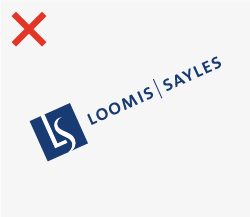
Figure 03
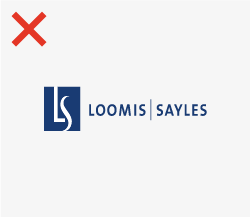
Figure 04
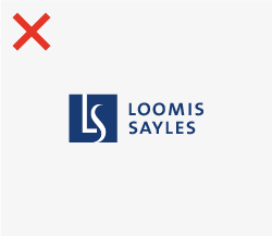
Figure 05
Figure 06
Figure 07
Figure 08

Figure 09
- Do not use another color for our logo other than those shown in the Logo Use section of our guide, even if that color is part of our brand system (Figure o1).
- Do not tilt or rotate our logo so that it isn’t in a normal, horizontal orientation (Figure 02).
- Do not stretch, compress, or distort our logo so that it uses incorrect proportions (Figure 03).
- Do not adjust the typographic treatment for the logo to create new lockups (Figure 04).
- Do not apply special effects to our logotype, including drop shadows, lens flares, and glow effects (Figure 05).
- Do not adjust the orientation of our typographic treatment, its relationship with our monogram, or allow our typographic treatment to appear on its own (Figure 06).
- Do not place our logo overtop an image that will not allow for enough contrast in any of our approved color options. (Figure 07).
- Do not place our logo over an employee’s headshot (Figure 08).
- Do not use our logo in a way where the quality or resolution of the file isn’t appropriate for the application (Figure 09).