Introduction
Since 1926, Loomis, Sayles & Company has helped fulfill the investment needs of institutional and retail clients worldwide. Using foresight and flexibility, Loomis Sayles looks far and wide for value—navigating traditional asset classes and alternative investments—to pursue attractive returns for clients.
These specific guidelines provide you with a succinct way to deliver the Loomis Sayles message with one strong, authentic voice. Please follow these rules closely whenever you have the opportunity to promote the Loomis Sayles brand and tell its story.
By following these guidelines as a system, rather than just a collection of assets, we accomplish some important goals:
- Create a clear and consistent look and message.
- Align all marketing materials to support the Loomis Sayles brand.
- Broaden the market’s perception of Loomis Sayles.
- Achieve best practices to increase effectiveness and efficiency.
Brand Identity
In this section, we outline the fundamental components of the Loomis Sayles brand. By understanding what we stand for, what we sound like, and what our mission is, you can also understand the strategy behind how we present ourselves to the world.
Brand Essence
Strategic Client Performance
Our brand essence is derived from our mission, vision, and cultural attributes we use to describe ourselves. It is considered in the development of all corporate branding materials.
- We are performance-driven investors who seek to identify exceptional opportunities through active management.
- Our small, focused teams offer the optimum balance between discussion and decision-making.
- Comprehensive best-in-class research is the critical centerpiece we use to identify and assess investment opportunities.
- We foster a culture of entrepreneurialism where all employees are encouraged to develop themselves and their ideas.
- We will always pursue continual improvement of our performance, processes, and people
Competitive Position
Within our industry, other brands tend to position themselves in a way where they’re either the radical disruptor or the traditional, historic institution. They’re either the “trusted advisor,” or they allow their notoriety to do the talking.
Loomis Sayles sits in its own category.
A history of thoughtful innovation.
At Loomis Sayles, no idea is developed in isolation. Since 1926, we’ve stood for foresight and flexibility. We support teams of portfolio managers, research analysts, and traders who work together to stimulate thoughtful discussions, explore ideas, offer insights, and identify opportunities to generate strong returns.
A humble reputation for trust.
When you choose Loomis Sayles as your investment, you’re putting your trust in a firm that has navigated challenging financial markets since 1926. No matter what, we want to ensure our clients have a clear understanding of the “why,” “what,” and “how” behind all of our investment strategies.
Brand Personality
Our personality pillars are the core components of the face to the Loomis Sayles brand. These qualities are intrinsic to our identity, and applied in the development of all branded materials.
Thoughtful
We are known for thinking deeply and broadly.
Courageous
We take informed risks because we are prepared to act when opportunities arise.
Disciplined
We are rigorous in our pursuit of consistent excellence.
Honest
We settle for nothing less than truth and transparency.
Corporate Logo
Our logo is our most recognizable brand element and the most integral part of our visual identity. Follow these guidelines to ensure it’s always treated with respect.
Our logo is comprised of two core elements: our monogram and our typographic treatment. Please contact Corporate Communications anytime a logo is needed. Files are not available on Docstore, and you should never attempt to recreate our logo.
Proper Use
We always want to ensure that our logo has enough clear space around it to ensure other design elements aren’t confused as part of our logo and that it is always legible.
Area of Exclusion
To measure the area of exclusion around our logo required to ensure clear space, the vertical divider in our typographic treatment (as it’s sized in the layout) should be used as the base measurement.
Color Variations
The color configurations shown above are the only approved variations of our logo.
- For light backgrounds, it’s preferred that our logo appears in Sea (our official brand color, which is described in the section on color).
- Over dark backgrounds, our logo should only appear as a full knockout. To ensure legibility, never use Sea over a dark background.
- The only time it’s acceptable for our logo to appear in a color other than Sea is when it needs to be reproduced in print, where black and white or greyscale is the only option. In those instances, it may appear in all black or as a knockout (depending on which provides the most contrast).
Sizing
In digital applications, our logo should never be smaller than 30px tall, or shorter than .3 inches tall in print.
Logo Misuse
- Do not use another color for our logo other than those shown in the Logo Use section of our guide, even if that color is part of our brand system (Figure o1).
- Do not tilt or rotate our logo so that it isn’t in a normal, horizontal orientation (Figure 02).
- Do not stretch, compress, or distort our logo so that it uses incorrect proportions (Figure 03).
- Do not adjust the typographic treatment for the logo to create new lockups (Figure 04).
- Do not apply special effects to our logotype, including drop shadows, lens flares, and glow effects (Figure 05).
- Do not adjust the orientation of our typographic treatment, its relationship with our monogram, or allow our typographic treatment to appear on its own (Figure 06).
- Do not place our logo overtop an image that will not allow for enough contrast in any of our approved color options. (Figure 07).
- Do not place our logo over an employee’s headshot (Figure 08).
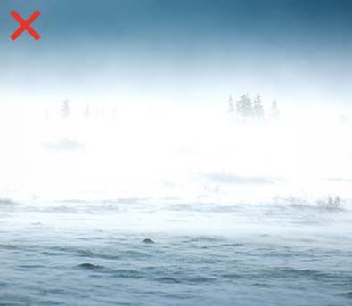
- Do not use our logo in a way where the quality or resolution of the file isn’t appropriate for the application (Figure 09).
London Lockup
Our London office (Loomis Sayles Investments Limited) has a unique lockup that differs from our American and Singapore (Loomis Sayles Investments Asia PTE. LTD.) offices. However, the same rules for use and misuse still apply.

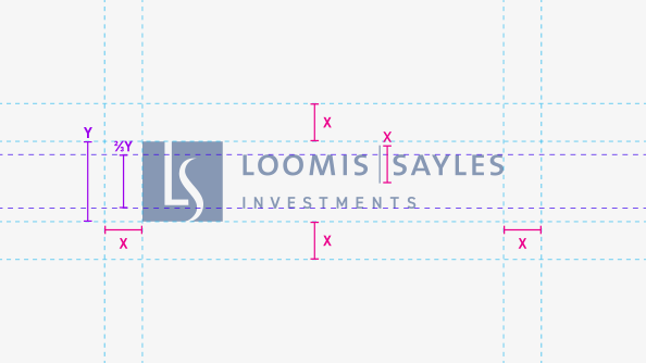
Proper Construction
As mentioned, the same rules for ensuring clear space apply to our London logo. The area of exclusion surrounding it is equal to the height of the vertical divider within the logo itself.
Never attempt to reconstruct the London logo instead of using official files. However, a similar logo developed in the future for a new global office should follow this construction (which will be initiated by Corporate Communications and Creative Services at that time).
The word “investments” is approximately 57% the size of the name “Loomis Sayles” within the London typographic treatment. A new global logo requiring secondary type would follow those same proportions.
If “Y” is the height of the monogram, then the overall height of the attached typography for a global logo would be ⅔Y.
The sizing and distance for the Loomis Sayles name should not change between or corporate logo and any global logos.
Secondary Marks
The LS Icon
In situations when space is extremely limited, the monogram from our logo can appear separate from the type. This treatment, which we call the Icon or “bug,” can be shown in white or Sea (depending on what provides the most contrast).
Registered Mark
The full Loomis Sayles logo has been registered with the US Patent and Trademark Office and should appear frequently and consistently on marketing materials.
The registered trademark logo is always accompanied by the attribution language:
“LS Loomis | Sayles is a trademark of Loomis, Sayles & Company, L.P. registered in the US Patent and Trademark Office.” When this attribution line is used, it should appear no smaller than point size 9 in the appropriate disclosure font.
This logo is not necessary for every placement, and the registered trademark should not appear on promotional items, both materials, business cards, or letterheads. The registered trademark should appear on the following applications:
- Fact sheets
- Commentaries
- Quarterly review materials such as bond and equity outlooks
The logo will appear with attribution for the following materials:
- Any corporate communications pieces, such as firm overview brochures, external speeches
- PowerPoint template and marketing books, with logo on title page and attribution line on the last page of the disclosure
- White papers, with logo throughout document template and attribution line on the last page of the disclosure
- Loomis Sayles folders
Primary Color Palette
The correct use of color across our brand touchpoints reinforces how recognizable the Loomis Sayles identity is through consistent repetition. Please only use the colors shown in this section for all branded materials.
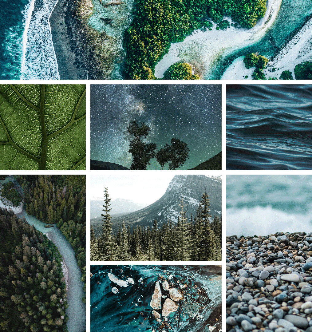
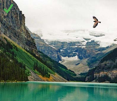
The Loomis Sayles corporate color palette reflects the dynamic vibrancy of earth’s varying landscapes, which are featured in the photographic imagery used across our branded materials. When used consistently, these colors help increase recognition of our brand.
Sea
The official Loomis Sayles blue (which we’ll refer to as Sea for the remainder of this guide, but is PANTONE 281C) is the single color used for our brand’s logo.
Pantone
281C (Sea)
| CMYK: | 100, 78, 0, 57 |
| RGB: | 0 32 91 |
| Hex: | #00205B |
Pantone
Cool Gray 7C (Stone)
| CMYK: | 38, 29, 24, 5 |
| RGB: | 152 154 154 |
| Hex: | #91929B |
Pantone
282C (Ocean)
| CMYK: | 100, 72, 0, 73 |
| RGB: | 22 39 74 |
| Hex: | #102547 |
Pantone
2192C (Sky)
| CMYK: | 91, 17, 0, 0 |
| RGB: | 0 152 211 |
| Hex: | #009CDE |
Pantone
7705C (Mountain)
| CMYK: | 97, 19, 7, 25 |
| RGB: | 0 111 142 |
| Hex: | #006A8E |
Pantone
326C (Jungle)
| CMYK: | 81, 0, 38, 0 |
| RGB: | 0 174 165 |
| Hex: | #00ACA0 |
Pantone
323C (Pine)
| CMYK: | 100, 0, 41, 51 |
| RGB: | 0 96 97 |
| Hex: | #006061 |
Secondary Color Palette
Secondary colors are used to highlight information or to crate graphs, icons, infographics, and other supporting elements. These colors complement our primary color palette as well as natural landscapes.
Pantone
2145C (Lake)
| CMYK: | 100, 71, 0, 2 |
| RGB: | 15 83 158 |
| Hex: | #0F539E |
Pantone
4148C (Glacier)
| CMYK: | 62, 22, 12, 5 |
| RGB: | 107 154 173 |
| Hex: | #6A9BB6 |
Pantone
3557C (Forest)
| CMYK: | 100, 0, 42, 25 |
| RGB: | 0 130 126 |
| Hex: | #008578 |
Pantone
7495C (Moss)
| CMYK: | 33, 10, 83, 21 |
| RGB: | 148 157 66 |
| Hex: | #929938 |
Pantone
128C (Tulip)
| CMYK: | 0, 7, 75, 0 |
| RGB: | 242 215 107 |
| Hex: | #E9D666 |
Pantone
277C (River Rock)
| CMYK: | 32, 8, 0, 0 |
| RGB: | 173 201 228 |
| Hex: | #B6CEE4 |
Pantone
2460C (Willow)
| CMYK: | 58, 7, 29, 2 |
| RGB: | 121 181 170 |
| Hex: | #76AE9E |
Pantone
614C (Bamboo)
| CMYK: | 11, 5, 41, 0 |
| RGB: | 222 215 150 |
| Hex: | #D8DAB1 |
Pantone
548C (Juniper)
| CMYK: | 100, 8, 11, 74 |
| RGB: | 0 67 82 |
| Hex: | #004654 |
Typography
In the same way we have a palette of colors we rely on to maintain consistency, we also have a specific palette of typefaces we utilize in our branding.
Our primary typefaces, Wremena and Din OT, should be relied on in most of our brand touch points.
Headings
Wremena is our typeface for headlines because of it’s classic yet forward-thinking and organic properties. It should always be used in sentence or title case: never in all caps. It’s typically used in its regular weight and set at a large size that provides it with ample contrast from surrounding type. If necessary, it can be set in Bold.
Subheadings
Din OT is used for subheadings because of its modern qualities. Depending on what provides the best contrast from the background, it usually can appear in its Regular or Demi-bold weight. Subheadings are always in all caps and use 105pt for tracking.
If subeadings are set at a large size (and legibility isn’t sacrificed), then they can be set at a much wider tracking (700pt) in Light or Demi weight for a dramatic effect.
Body Copy
Din OT is also used for body text because of its improved legibility. For body copy, Din OT’s Light or Regular weight may be used (depending upon which provides the most legibility). To ensure that there’s proper contrast from subheadings, body copy should always be set at a smaller size with its tracking set to 0pt. Bold or italic may be used on portions of text to add emphasis.
Our secondary typefaces, Century Gothic and Trebuchet MS, are for applications that rely on the Microsoft Office suite. Pitch Book Power Point presentations are an example of when we would use these typefaces for ease of editing.
Headings
Century Gothic is our typeface for headlines. When it’s being used for a main document title, it should be used in title case for legibility. In all other large titles, it uses all lowercase. To add emphasis, its Bold weight may be used on select portions of text.
Subheadings
Century Gothic is also used for subheadings. Subeadings should always be set in all caps to provide contrast from main headlines. They should also never appear in large sizes to maintain a clear hierarchy within our content.
Body Copy
Trebuchet is used for body copy in Microsoft documents because of its similarity to Din OT. It should generally use its Regular weight; however, it’s permissible to add bold or italics to portions of text that need emphasis.