Proper Use
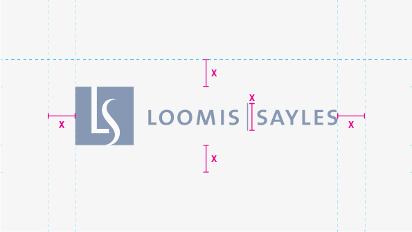
We always want to ensure that our logo has enough clear space around it to ensure other design elements aren’t confused as part of our logo and that it is always legible.
Area of Exclusion
To measure the area of exclusion around our logo required to ensure clear space, the vertical divider in our typographic treatment (as it’s sized in the layout) should be used as the base measurement.
White background
Dark Background
Knockout over Image
Black and White
Color Variations
The color configurations shown above are the only approved variations of our logo.
- For light backgrounds, it’s preferred that our logo appears in Sea (our official brand color, which is described in the section on color).
- Over dark backgrounds, our logo should only appear as a full knockout. To ensure legibility, never use Sea over a dark background.
- The only time it’s acceptable for our logo to appear in a color other than Sea is when it needs to be reproduced in print, where black and white or greyscale is the only option. In those instances, it may appear in all black or as a knockout (depending on which provides the most contrast).
Sizing
In digital applications, our logo should never be smaller than 30px tall, or shorter than .3 inches tall in print.